

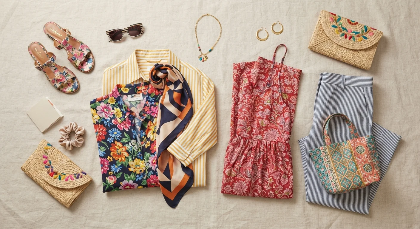
Key Takeaways
- Scale contrast is the most reliable foundation for mixing prints successfully.
- Anchoring prints in a shared color palette keeps outfits cohesive rather than chaotic.
- One statement print per outfit is a useful starting point for building confidence.
- Solid neutrals act as visual breathing room between competing patterns.
- Print placement affects proportion - understanding this helps every body type wear patterns with ease.
What you will need
Why Print Mixing Feels Intimidating - and Why It Doesn't Have to Be
For many people, prints feel like a commitment. Unlike solids, a patterned piece announces itself - and combining two or more prints can feel like a high-stakes experiment. The fear of looking mismatched or "too much" keeps entire categories of interesting clothing hanging unworn in the back of the closet.
The good news is that print mixing is a learnable skill grounded in a handful of repeatable principles - not innate talent or fashion insider instinct. Once you understand the mechanics of scale, color, and placement, what once looked chaotic begins to look intentional. If you're still building your foundational fashion vocabulary, key style concepts worth knowing offers a useful starting point before diving into pattern play.
Start With What's Already in Your Closet
Before experimenting with new combinations, lay out every printed piece you own alongside your solid neutrals. Patterns you'd never thought to combine often share a hidden tonal thread that makes them natural partners. This exercise also reveals wardrobe gaps - a simple striped tee, for instance, can be the connective tissue between a floral skirt and a geometric scarf.
The steps below walk you through a practical framework - one you can apply to pieces you already own today.
What you will need
How to Mix Prints With Intention
Confident print mixing follows a clear sequence: establish a color connection, contrast the scale, and manage visual weight deliberately. Work through each step in order, and assess the result in a full-length mirror before finalizing your look.
Avoid Mixing Prints of the Same Scale
Placing two prints of nearly identical repeat size side by side - say, a small ditsy floral next to a similar-scale houndstooth - creates visual competition rather than harmony. The eye struggles to settle, and the result reads as accidental rather than intentional. When in doubt, choose prints that differ noticeably in size: one bold, one subtle.
Identify the dominant color in each print
Before combining any two patterns, isolate the one or two colors that appear most prominently in each print. These are your anchors. When at least one dominant color is shared - even if the shade varies slightly - the prints will read as intentionally connected rather than randomly thrown together.
For example, a navy-and-white stripe and a floral with navy leaves will feel related even though their patterns are completely different. This shared thread is what prevents an outfit from feeling chaotic.
Contrast the scale of your prints
Scale contrast is the most effective technique a stylist can deploy. Pair a large, bold print - a wide floral or oversized plaid - with a much smaller, finer pattern like a thin stripe, micro check, or tiny polka dot. The difference in repeat size gives each print its own visual territory so neither overwhelms the other.
Think of it as a conversation: one print speaks loudly while the other provides a quieter supporting note.
Use a solid neutral to separate or ground the look
Not every print combination needs to be worn simultaneously from head to toe. A solid neutral piece - a tailored blazer, simple trousers, or a plain belt - acts as breathing room and prevents visual fatigue. Even a neutral shoe can be enough to ground a printed top-and-bottom pairing.
This is especially useful when you're starting out: mixing prints becomes far less intimidating when you know a solid piece can always step in as a reset.
Limit the number of active prints per outfit
A reliable starting rule: one statement print and one supporting print per look. The statement print is the piece you want to highlight - a bold floral midi skirt, a wide-stripe shirt. The supporting print plays a secondary role and should be quieter and smaller in scale.
As your confidence grows, you can experiment with three prints, but keep the color palette tight across all three to maintain coherence. If you're interested in how maximalist dressing pushes these boundaries, our overview of quiet luxury vs. maximalism puts print-heavy styling in useful aesthetic context.
Assess print placement relative to your silhouette
Where a print sits on the body influences visual emphasis. Larger, higher-contrast prints draw the eye toward the area they cover, while smaller or lower-contrast prints recede. Use this intentionally - a bold print worn where you want emphasis, a subtler pattern elsewhere.
This isn't about following rigid style rules - it's about understanding how visual perception works and making deliberate choices. For more on this, see our guide on visual proportion and dressing.
Once you've practiced this sequence a few times, it becomes intuitive. The goal isn't to follow rules rigidly - it's to build enough understanding that you can break them knowingly. For readers thinking about how prints fit into a broader wardrobe strategy, our piece on capsule wardrobes versus trend-driven closets explores how to balance statement pieces with versatile foundations.
Proportion Matters More Than Pattern Rules
There are no universal laws that make a print "work" or "not work" on a particular body type. What visual research does support is that scale, contrast, and placement influence how the eye moves across a silhouette. Experiment rather than restrict - and consult our guide on visual proportion in dressing for a deeper look at what the evidence actually says.